intersection of possibilities
L = Executive Creative Director
El Paso, Juárez and Las Cruces had been experiencing a renaissance for some time, but outsiders didn’t know this. Our region’s story was being buried or horribly misconstrued. We needed to break through the noise and control our own narrative. But to do so, the three cities needed to unite and develop a strategic brand, messaging and marketing plan that would promote business growth and economic development in the unique border region.
The decision for El Paso, Juárez and Las Cruces to link arms was strategic. Each city possesses its own valuable strengths and assets. However, when joined together, those assets are multiplied. Each city is truly part of a greater whole that is more marketable to site selectors and business owners who have the potential to drive positive economic change in the area. Moreover, our research showed that the proximity of El Paso, Juárez and Las Cruces to the U.S. and Mexican border creates unique points of intersection that foster opportunity, innovation and creativity unlike anywhere else. Therefore, the brand and the content created around it needed to reflect the idea that opportunities flourish at our unique points of intersection.
After more than a year and half of competitive research, interviews with economic development stakeholders from all of the world, and extensive creative ideation and testing, my team and I developed the messaging, brand and digital content platform for The Intersection of Possibilities. The initiative was launched with an epic video that showcases a brief glimpse of the region's offerings and testimonials from successful business owners. Today, the content hub, which will continue to expand over time, serves as the home of the brand, compelling stories and informative content that is so valuable to economic development innovators around the world.
Reaction to the brand and marketing initiative has been extremely positive across the region and beyond. Local economic development stakeholders are relieved to finally have a unified brand they can use to exemplify the region they represent. Local residents are thrilled to claim ownership of a brand that truly visually represents their home. Outsiders are taking notice of a region they may have once overlooked but are now very curious to explore. Now, more than ever, the region is being considered viable for business success and development is booming!
Go to intersectionofpossibilities.com to see more.
THE BRAND SYMBOL IN DEPTH
Our competitive review of economic development brands clearly showed a sea of monotone, corporate sameness. Our region’s story was already being buried or misconstrued. Breaking through the noise and controlling our own narrative would need to begin with a vibrant brand that would stand out amongst all the rest.
Intersections
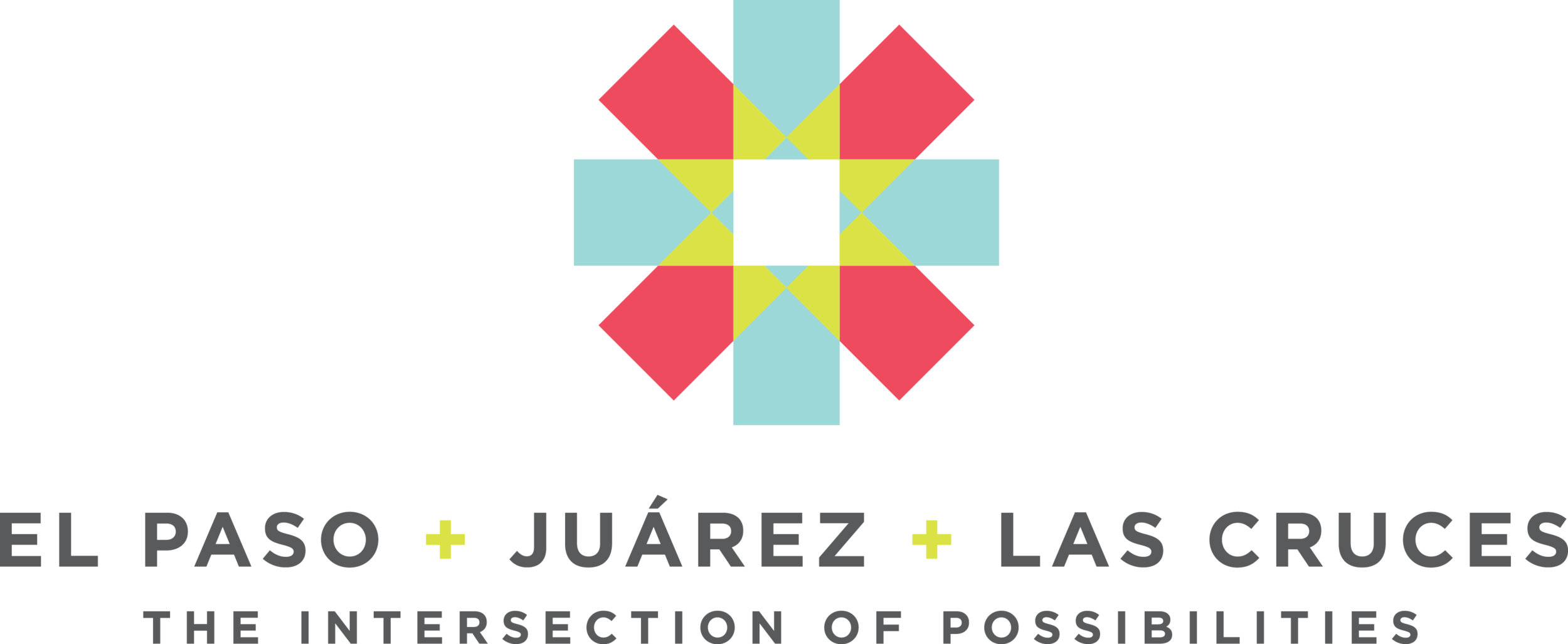
In this logo, each city is represented by an icon that is synonymous with its individual identity.
El Paso, famous for its good weather, is known far and wide as the “Sun City.”
Juárez is often represented by visuals of the enormous and iconic “La Equis” created by Mexican sculptor Sebastian. “La Equis” is located just south of the El Paso-Juárez border on the bank of the Rio Grande and was designed to represent the intersection of the indigenous Aztec and the Spanish cultures.
Las Cruces, which means “the crosses” in Spanish, is often identified with visuals of crosses, such as the icon on the city’s flag.
Each icon is strong on its own, but when they are overlapped, or intersected, they reflect the region as a greater and more dynamic whole.
THE EQUATION
The use of plus signs (+) was chosen to convey the idea of an equation that consists of parts. If one of the cities is removed from the equation, the sum changes and is not as great.
The plus signs also visually further emphasize the concept of intersections.
Colors
The color palette of the logo reflects the region’s bright and colorful culture. These are the colors you see in abundance throughout the region on homes, murals, buildings, fashion and decor.
The color palette was also inspired by local artist Adrian Esparza whose serape installation series weaves color in and out to create complex and stunning visual intersections made of thread.
Typography
We chose to use Gotham, a font that is clean, modern and strong. The logo’s typographic design is simple and bold, so as not to take away from the icon, but strong enough to stand on its own when necessary.
Tone
Overall, while the logo is true to the unique character and flavor that is woven together within the many intersections of the region, a sense of progress and modernity is also apparent. The logo is bright, hopeful and positive. It is also strong, unwavering and proud.


